Category: Faith & Spirituality, Featured, Highlights Topics: Calligraphy, History, Preservation Of The Quran, Quran Views: 5250
5250
Calligraphy of the Quran

Arabic calligraphy is a form of reverence for the Qur’an (photo: British Library).


Arabic calligraphy is a form of reverence for the Qur’an. This article outlines the development of qur’anic calligraphy, from some of the earliest existing Qur’ans. It also explores geographic variations in scripts alongside developments in Arabic grammar, changing mediums and Qur’an formats.
In Islam, the text of the Qur’an is considered sacrosanct and infallible, and as such the physical form of the book is treated with reverence. Devotion to the book is exemplified by the way Qur’an manuscripts have been devoutly and assiduously copied throughout the centuries, exhibiting diverse styles of calligraphy and illumination, which often reflect their place of origin and date of production.
What do we know about the calligrapher’s role?
Our knowledge of the working practices of calligraphy and illumination comes from medieval handbooks and manuals for scribes who, in their capacity as court officials, were also responsible for drawing up documents. The calligrapher would be responsible for planning the page for the text, organising the space of the page and the use of the ruling frame (mistarah) which enabled him to write in straight lines. The calligrapher belonged to a professional class; in order to gain membership to this class, the scribe needed to obtain a diploma (ijazah), after several years of working under a master calligrapher. This apprenticeship included training in trimming reeds for the pen (quills were not used as in Western Europe) and in the preparation of inks including, among other ingredients, carbon, iron-gall and gum-arabic.
What was calligraphy like in the oldest Qur’ans?
The earliest Qur’an manuscripts were produced in the mid-to-late 7th century CE (1st century Hijrah), although it is difficult to be precise about their date due to the fact that ancient copies from this period have not survived intact and exist only in fragments. The importance of these fragments cannot be overestimated as they provide the only available evidence for the early development of the written recording of the Qur’an text. To a great extent, the history of Qur’an manuscripts is the history of Arabic script. For, in copying the Qur’an, calligraphers have made use of a wide range of styles, reflecting stages in the development of Arabic writing.
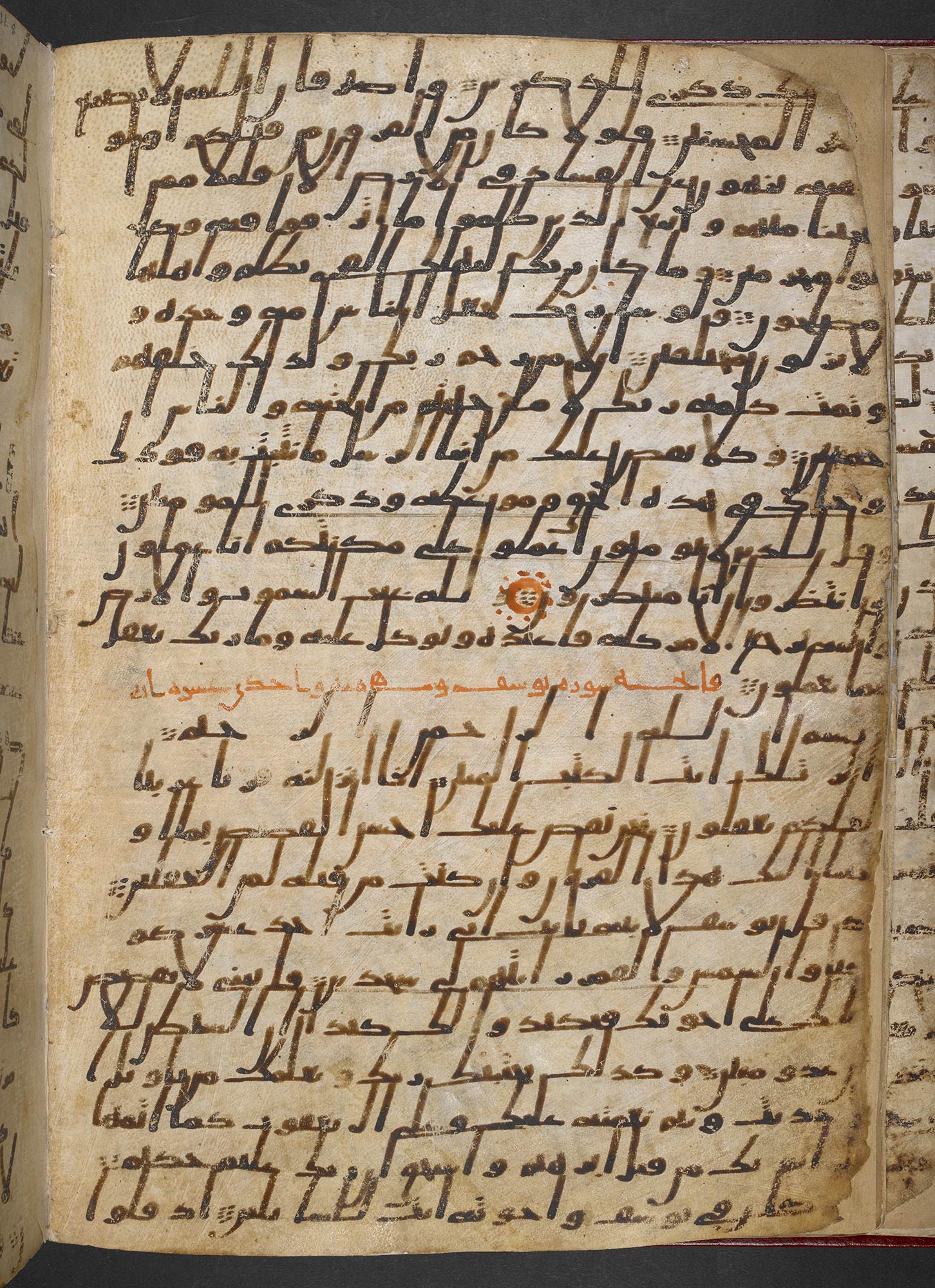
The Ma’il Qur’an is one of the very earliest Qur’ans in the world (photo: British Library).
One of the oldest surviving Qur’ans is the so-called Ma’il Qur’an, which dates from the 8th century and comes from the Hijaz region of the Arabian Peninsula . It is an almost complete codex, and is the largest fragment of consecutive text of the Qur’an that we have. The word ma’il means ‘sloping’ and refers to the script’s pronounced slant to the right. The script can also be recognised by the distinctive traits of some of its letters, in particular alif and ya’ (the first and last letters of the Arabic alphabet). In the Ma’il Qur’an, like in other ancient fragments, there are no textual indicators to differentiate between letters of a similar shape or indicate vowel sounds. In early Qur’ans the method for numbering verses was not fully developed either. In the earliest fragments, such as the Ma’il, the end of each verse is indicated by six small dashes in two stacks of three. A later development in the verse numbering of this Qur’an was the addition of red circles surrounded by red dots to mark the end of every ten verses. Likewise, chapter headings were also added later in a different script and colour from the rest of the text. When chapter headings were later introduced, the wording stated the name of the chapter, the number of verses and whether the particular chapter was revealed in Mecca or Medina.
When were vowel signs added?
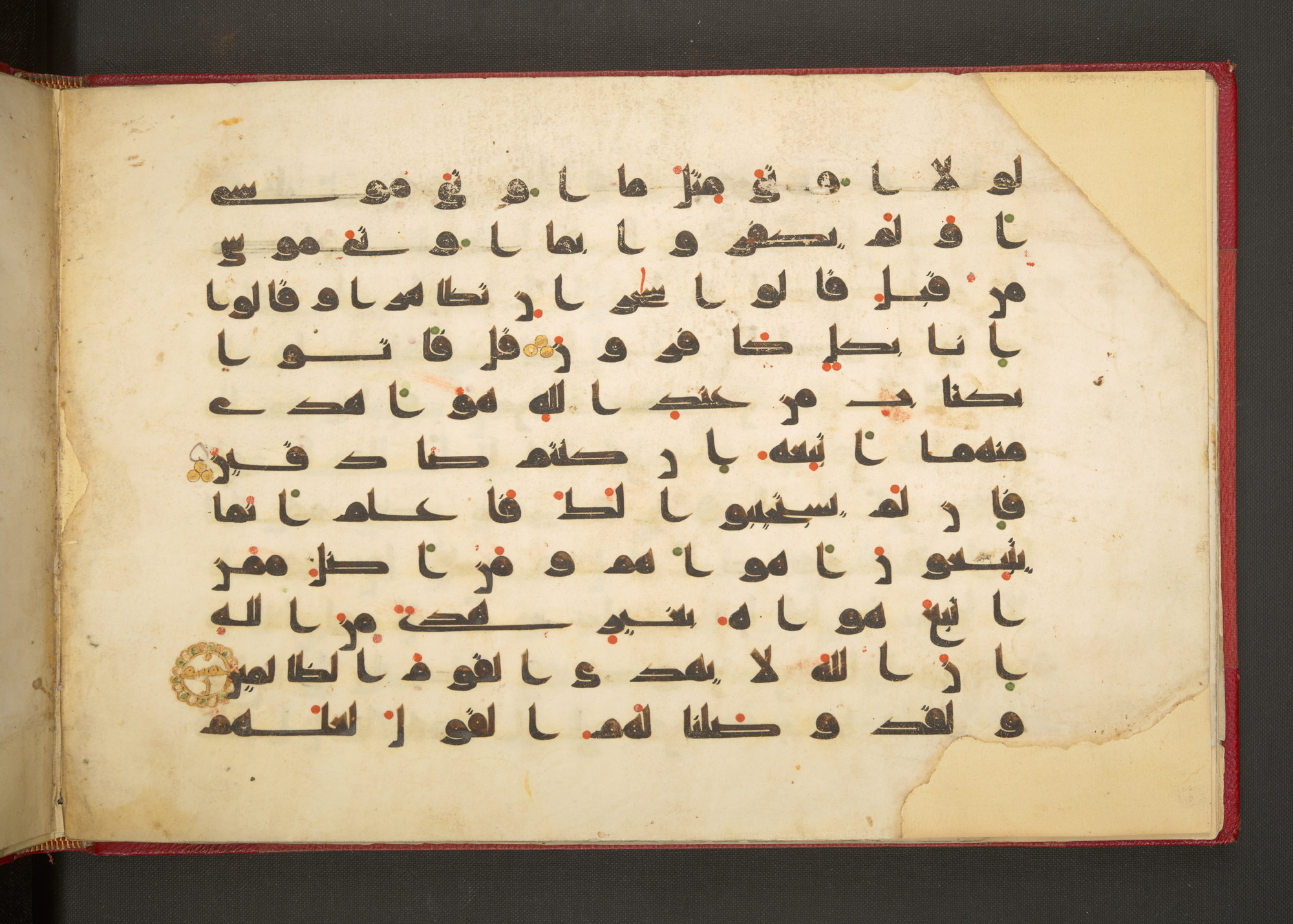
The physical shape of the earliest Qur’an codices was vertical in format, as exemplified by the Ma’il Qur’an. But, as demonstrated in early Qur’ans of the 9th and 10th centuries written in kufic script, the choice of script can be seen to have had a major influence on the shape of the volume, which was now produced in a horizontal format.
A 9th-century Qur'an in kufic script (photo: British Library).
With its very short vertical and elongated horizontal strokes, the kufic style is certainly suited to the oblong format of Qur’ans produced in the Near East. The angular script takes its name from the town of al-Kufah in southern Iraq, where the script is thought to have been developed. The horizontal format is thought to have been originally inspired by the shape of unrolled papyrus scrolls, also possibly by the oblong wood and stone panels inscribed with Qur’anic quotations on the walls of mosques. The earliest examples of Qur’anic inscriptions in kufic script, dating from 692 CE, appear on the Dome of the Rock in Jerusalem. Qur’ans in kufic script are organised in blocks, with the words of text often split between the end of one line and the beginning of another. Signs were introduced into the text as an aid to pronunciation. A system based on a method developed by the 7th-century founder of Arabic grammar, Abu al-Aswad al-Du’ali, was introduced: red dots were added to indicate vowels, with green dots to indicate the glottal stop (hamzah). In the 8th century, a system of short black diagonal strokes was further introduced to avoid confusion between similar-shaped letters. Credit for this system is attributed to al-Hallaj ibn Yusuf, a governor of the Islamic East during the Umayyad Caliphate (661–750), who instructed pupils of Abu al-Aswad al-Du’ali to solve the problem.
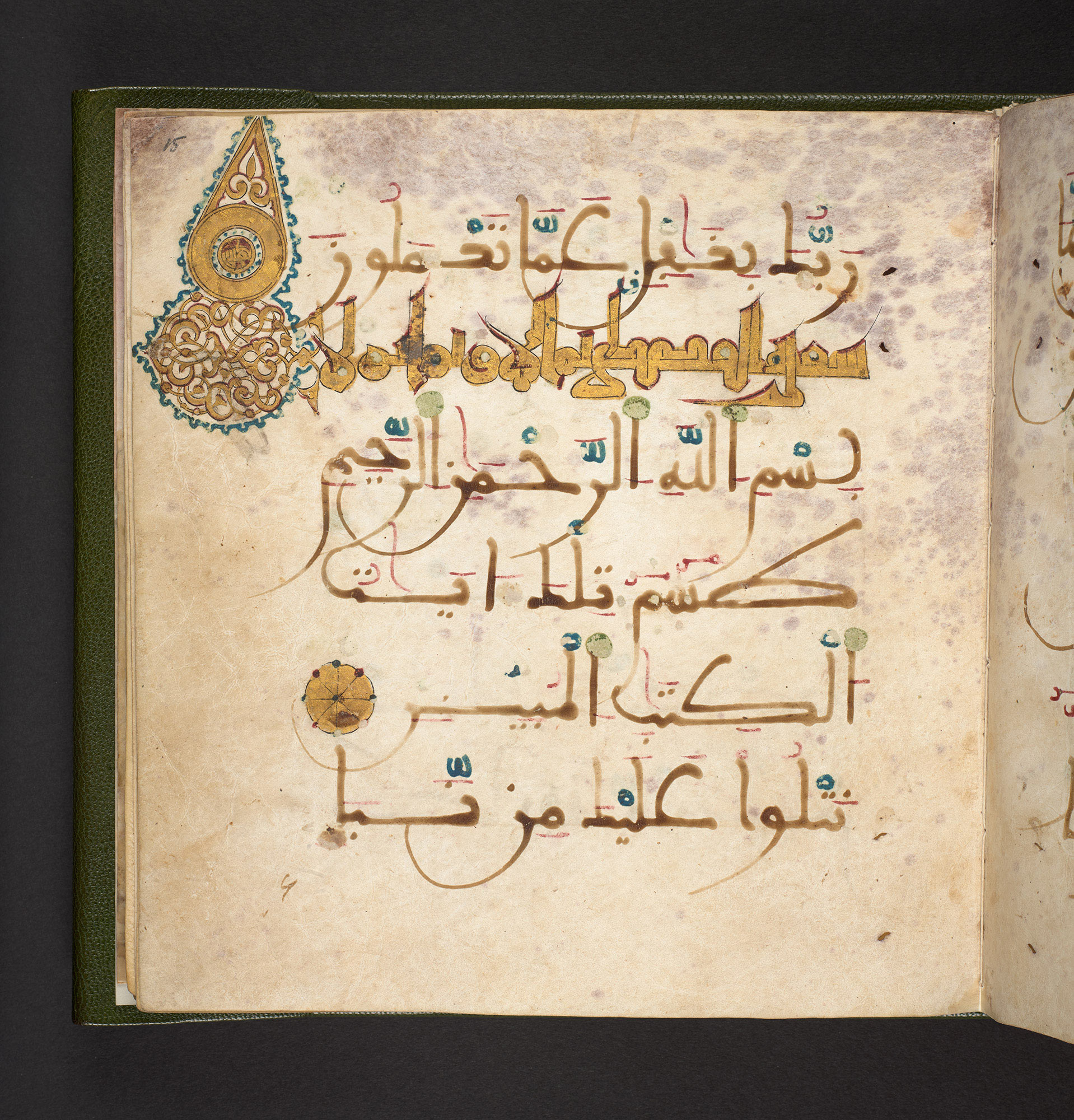
From the 10th century, Qur’ans were once again being produced in a vertical format, thus underlining the relationship between the physical shape of the volume and the script of the manuscript. The return to the vertical format was largely necessitated by the choice of script, due particularly to the appearance of eastern kufic, which is characterised by long upright strokes and short strokes inclining to the left. First developed by the Persians, specific styles then evolved within eastern kufic, such as Qarmatian.
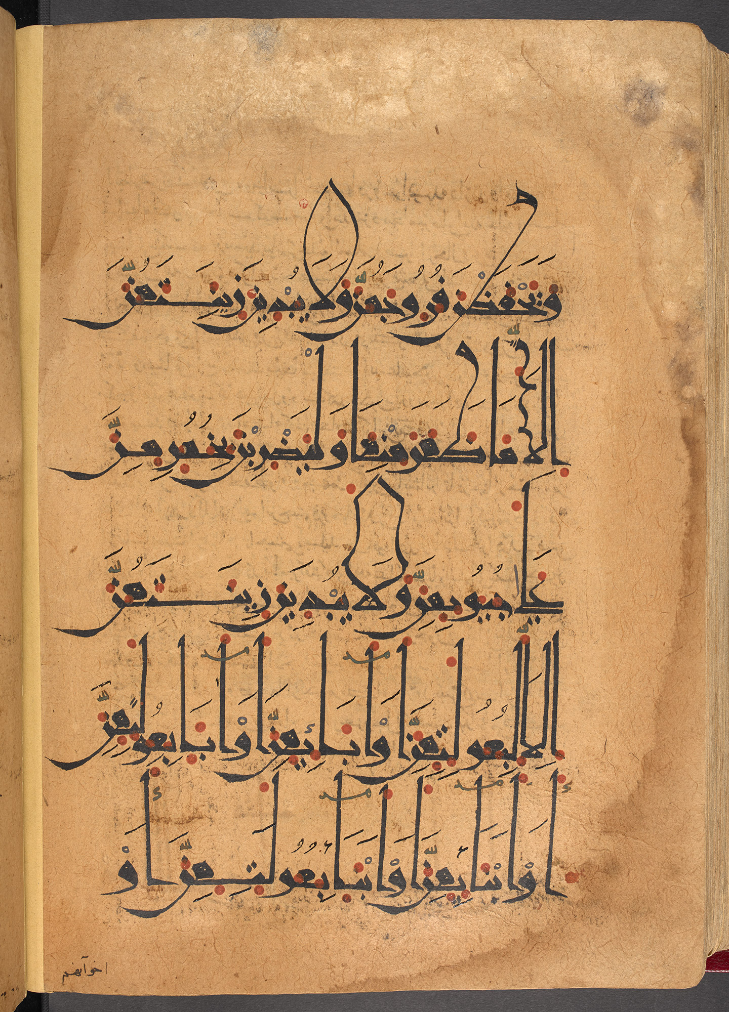
Qur'an in eastern kufic script, from Iraq or Persia (photo: British Library).
The Arabic verb qarmata suggests that the script is finer and the letters closer together. The notation of vowel signs, developed by the 8th-century grammarian and philologist al-Khalil ibn Ahmad, began to appear in Qur’an manuscripts. The older system of simple red dots, associated with Abu al-Aswad al-Du’ali, was now combined with the vowel signs we would recognise from use today.
Are different scripts used for different purposes?
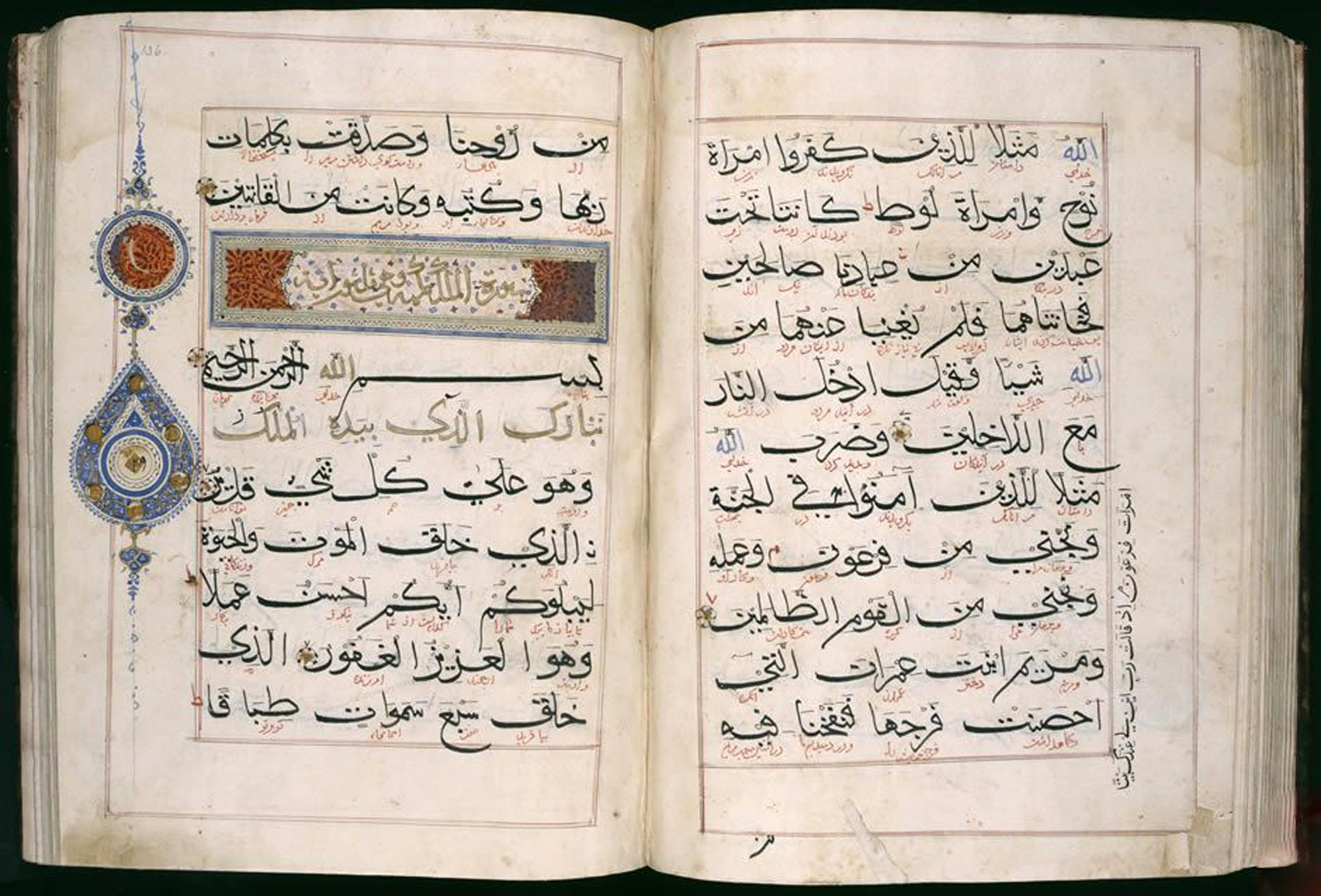
While parchment was the favoured material for early Qur’ans, with the introduction of papermaking in the Islamic world, paper gradually began to be chosen as the preferred medium. Some of the earliest Qur’ans written on paper were penned in a cursive script, proportional in style, known as naskhi. The Abbasid calligrapher Ibn Muqlah (886–940) developed the style in the 10th century, and Ibn al-Bawwab (d. 1022) continued his work. Though kufic and an early type of naskhi were both concurrently in use between the 8th and 10th centuries, the latter became associated with documents of an administrative and commercial nature, mainly due to its legibility. Nonetheless, while eastern kufic was predominantly used for copying the Qur’an text, the introduction of naskhi in the Islamic East from around the late 10th century may have contributed to the re-adoption of the vertical format of codices in general.
A 11th-century Qur'an from Iraq or Persia in early naskhi script (photo: British Library).
The impact of early naskhi can be easily appreciated from its appearance upon the Qur’an page. A striking feature of the layout in such a Qur’an is the distribution of the space occupied by the script and the illumination, both being packed densely together within the text area, with marginal ornaments almost touching the area of the text in a way that is reminiscent of an overlapping chain. By the middle of the 11th century, the relationship between naskhi and kufic had developed further and can be seen to be one of contrast between text and ornament. Kufic was now an archaic script used only for ornamental purposes to inscribe the text within the illumination. Hence, in an 11th-century Qur’an written in early naskhi script, the larger overlapping roundels marking the end of a tenth verse have their relevant verse number spelt out in kufic.
Are there regional differences in Qur’anic calligraphy?
During the reign of the Umayyad caliphs (661–750), who ruled from Damascus, Islam spread west from Egypt to Libya, Tunisia, Algeria and Morocco. Expanding also into the Iberian Peninsula, Islam became the dominant power in Spain from 711 until the Christian re-conquest during the second quarter of the 13th century. Qur’ans from North Africa and Spain differ significantly from those produced in the Islamic East. One difference can be seen in their use of writing material. While parchment was no longer a material of choice in the Islamic East, the Islamic West continued to produce Qur’ans on parchment until the 14th century, no doubt because this region of the Islamic world was late in its introduction to paper manufacture. A regional style of the maghribi script also developed in the West with its own peculiar characteristics. Named after the province of Maghreb in North Africa, it became the script used for copying Qur’ans in North Africa, and by the 12th century had also been adopted in Andalusian Spain. A number of features differentiate maghribi from other Arabic scripts, particularly in the way the letters fa’ and qaf are written. Its vowel signs are usually penned in red or blue, with the glottal stop also indicated by coloured dots. The characteristics of maghribi clearly show that its origins lie in western kufic, the regional version of kufic developed in Tunisia during the 10th century. A prominent characteristic of the maghribi script is the round and deep curves extending below the line. The interrelationship between these scripts is highlighted in the pages of a 13th-century Qur’an from Spain, which contrasts its ornamental chapter headings, written in gold angular western kufic, with its text in maghribi. The maghribi script in the main body of the text gives these Qur’an pages the sense of space and movement associated with cursive scripts.
A 13th-century Qur'an from Spain, written on parchment (photo: British Library).
Can the script help us understand the text?
Scripts in various styles and colours were employed not only for decorative purposes. They often had a more functional role, highlighting specific words or sentences. This was to help the reader to identify the hierarchy of texts where more than one text appeared on the page; and it was particularly important for those pages which carry not only the sacred text but also a translation of the original Arabic. In Islamic tradition the Qur’an is inimitable in any language, so the interlinear translations at their very best were no more than aids to comprehension. An example of this is demonstrated in a Qur’an from India, copied around 1500 during the rule of the Delhi sultans. The Qur’an text in black naskhi script known as bihari alternates with its interlinear Persian translation written in a small red naskhi script. Allah’s name is highlighted in blue throughout the text, and in gold where the name is mentioned in the pious invocation (basmalah) beneath the illuminated chapter heading. The marking of the divine name in another colour is a common feature of Qur’ans in bihari script.
An early 16th-century Qur'an from India written in bihari script (photo: British Library).
Qur’ans from China
In the 8th century Muslim merchants were already trading in China. A community is known to have been established in Xian, where a mosque was built in 742. However, the impact of Islam in China and Central Asia was not strongly felt until the period of Mongol rule in the 13th century. In Chinese Qur’an manuscripts the script, a variation of muhaqqaq, is penned in a way which suggests that the pen strokes were influenced by Chinese calligraphy, and is often referred to as sini (‘Chinese’) Arabic. A central panel is a prominent feature of Chinese Qur’ans on their decorated pages, which usually contain as few as three lines of text, with only a few words on each. The adaptation of symbols common to Chinese art and culture is also evident in their decoration. For instance, in the final opening of a 17th-century Qur’an, a lantern motif has become the visual vehicle for text in its decorated pages. The impression of a Chinese lantern is further reinforced by pendulous tassels attached to the hooks on the outer side of the structures.
Lantern motif decoration from an 17th-century Chinese Qur'an (photo: British Library).
Dr. Colin F. Baker is Head of the British Library’s Middle Eastern and Central Asian Collections. He has worked extensively on Arabic and Judaeo-Arabic manuscript collections. He was one of the curators of the British Library’s 2007 exhibition Sacred and, to coincide with the exhibition, he wrote the book Qur’an Manuscripts: Calligraphy, Illumination, Design (British Library, 2007).
( Source: Republished under the Creative Commons License from the British Library ).
Category: Faith & Spirituality, Featured, Highlights
Topics: Calligraphy, History, Preservation Of The Quran, Quran
Views: 5250
Topics: Calligraphy, History, Preservation Of The Quran, Quran
Views: 5250
Related Suggestions